 I’ve dedicated part of my ’11 summer time reading Steve Krug’s book «Rocket Surgery Made Easy»; I found it so wonderfull that I enthusiastically recommend its lecture and I’ll spread up wich are (for me) the most outstanding points.
Usability Testing definition:
watching people try to use what you’re creating/designing/building (or something you’ve already created/designed/built), with the intention of (a) making it easier for people to use or (b) providing that it is easy to use.
Steve argues that, what he explains in the book works because (p16-17):
- all sites have problems,
- most of the serious problems tend to be easy to find, and
- watching users makes you a better designer.
- (my) highliht: even though terms like «user centered design» and «user experience» are now in the vocabulary of most people working on Web sites, relatively few designers, developers, stakeholders, managers, and check-signers have actually spent any time watching how people use Web sites. As a result, we end up designing for our abstract idea of users, based for the most part on ourselves.
When asking for the utility of data gathered with Web Analitycs tools (p18-19),
… they are utseful but, … tey can’t tell you why they’re (the users) doing those things.
Demo Test video:
A morning a month, that’s all we ask
Do-it-yourself testing doesn’t do everything the Big Honkin’ Test Does, but it produces the results you need at a price you can afford.
Given the shor cicles in Agile software development methodologies (sprints), if you wait a month the world will have passed you by. Perhaps it’s more like «A morning a sprint, that’s all we ask«.
Wasting (stakeholders, developers, managers, designers, ..) time looking a user test is useful because
… you don’t understand your users as well as you think you do.
Testing the sketch on the napkin (p34-36)
Napkin tests aren’t full tests; they’re like the Home page tour you saw me (Steve) do in the demo test video (see above).
- 5 minutes
- test with friends, neighbours, or anyone you run into
- NOT asking their opinion or feedbak; ASKING them to look at the sketch and try to figure out WHAT THE THING IS.
Testing Wireframes (p36)
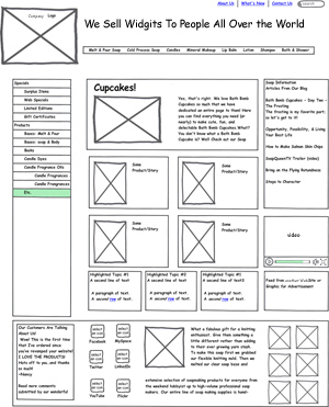
A wreframe is a schematic diagram of a page. Typically, it shows where differents kinds of content will go, the relative prominence of things like headings, and navigation devices like menus and search.
Testing page designs (p37)
Where wireframes focus on interaction, comps (visual treatments) focus on the visual design.
And now, about testing with THE USERS:
(P41): two (great) sentences, two ideas to have in mind:
- «People who presumably have domain knowledgedon’t always know what you think they know«
- «Many of the most serious usability problems have nothing to do with domain knowledge anyway; they’re related to things like navigation, page layout, visual hierarchy, and so on -problems that almost nobody will encounter«
Three is enough (p43)
This part debates about one big usability users testing question, «how many participants do we need ?????» … in the do-it-yourself method three is enough. It is because we’re not interested in what it takes to uncover most of the problems; we only care about what it takes to uncover as many problems we can fix.»
And, talking about some things for them to do (p52)
«the trick is to make sure te tasks you test reflect you user’s actual goals, not just your idea of what they want to do.»
And … prepeare extra tasks for people who finishes early !!!
Make tasks into scenarios (p53)
- Scenario definition: «…script that the user can read, understand and follow.» Scenario, also provides some context («You are …», «You need to …») & information that users need to know, but doesn’t (e.g., username and password for a test account). BUT trim any detail that doesn’t contribute.
Conducting the test session (chapter 8, p62-89).
ALL recommended, especially:
- The Home Page Tour (p75):
- We are NOT asking for their pesonal opinion
- 2 or 3 minutes
- Scroll YES, click NO
- The Tasks (p76):
- facilitator reads aloud the task, NOT the user.
- when you (the facilitator) decide it’s time to move on?
- the task is completed
- te participant is «miserable» (overrated, blocked, …)
- schedule has been exceeded
- you do not learn anything new
- DO NOT USE the searcher
- Probing (p78)
- 5 minutes
- AT THE END … suggestions, ideas
Facilitator recommendations:
- Stay neutral (p82)
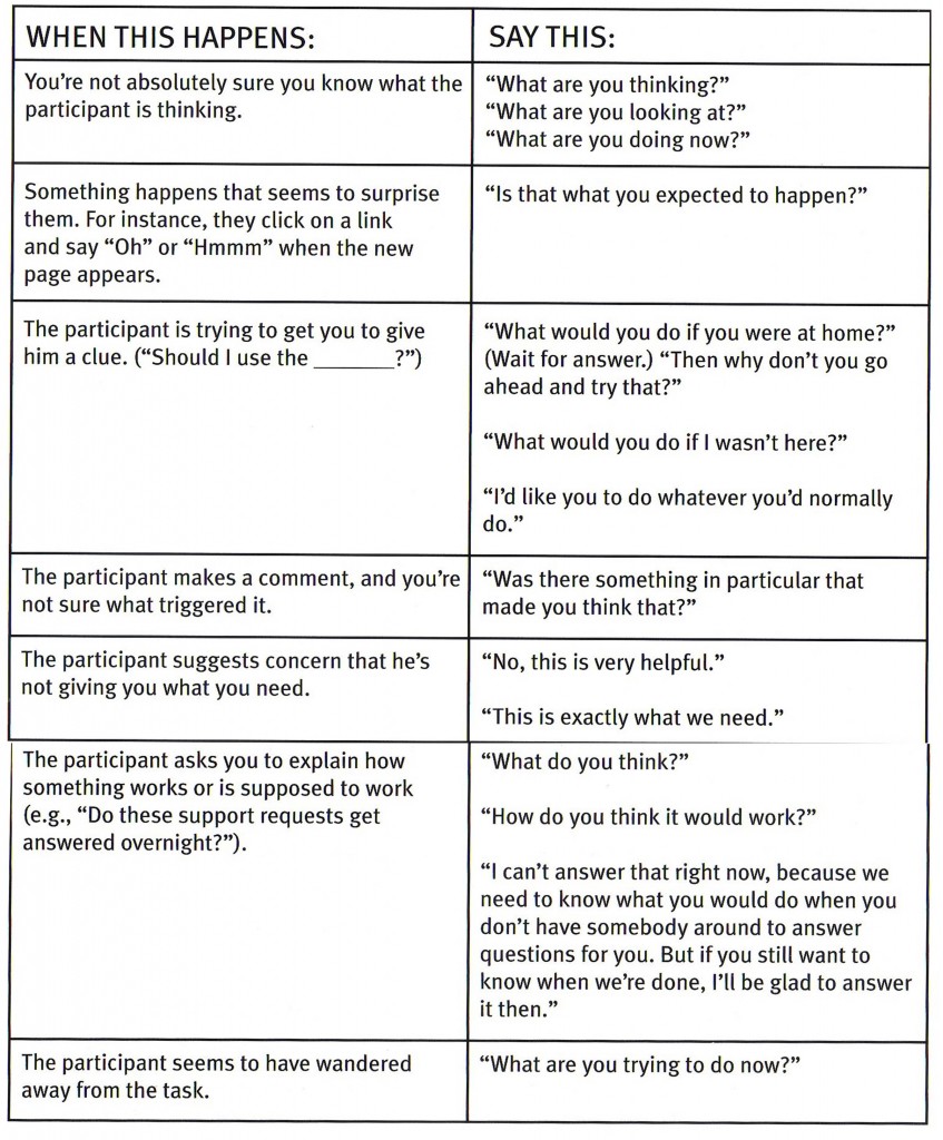
- Handy chart (p83-84): see below all the chart, it’s excellent

With the do-it-yourself method
- Pre & Post tests ARE NOT NEEDED (p88)
- Krug recommendation: DO NOT record user’s face (p89)
Staskeholders, managers, developers, designers, editors, writers, … all them should attend test sessions (chapter 9, p90-101)
- Seeing is believing (p91)
- whatching usability tests in person is a transformative experience
- most people think that all users are like them … they’re not like me, and in fact they are not like anybody
- Observers will write down the three most important usability problems they saw in the session (p93)
- Instructions for Observers Word PDF
Debriefing meeting (p105)
- Important problems?
- will a lot of people experience this problem?
- will it cause a serious problem?
Tips for success (p107-108)
- After the debrieffing, it’s a good idea to summarize the testing in a short e-mail (short = 2 minute to read !!!)
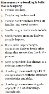
Tweak, don’t redesign (p114)

A tweak is a slight adjustement or modification, often one that requires a few rounds of trial and error to get it exactly right.
- Try a simpole tweak first
- If it doen’t work, try a stronger version of the same tweak
- If the first tweak doesn’t work, consider trying another
- Always keep an eye out for unintented consequences.
Take something away (p117)
The Big Bang Theoty of Web Usability
- recommended readings:
- Lindgaard, G., Fernandes, G., Dudek, C. & Brown, J. (2006). Attention web designers: You have 50 milliseconds to make a good first impression!, Behaviour & Information Technology. 25, 115-126 (awarded best paper for 2006, 25th. Anniversary of BIT)
- http://www.websiteoptimization.com/speed/tweak/blink


