Artículo realizado por la estudiante Tatiana Vilalta en el marco de la asignatura User Centered Design del Grado en Ingeniería Informática de la Universitat de Lleida correspondiente al curso 2014-15.
Introduction
“Colour is one of the most powerful tools in the designer tool kit”. As I read articles about Colour, UX Experience, UX Design… I wondered how importance have the colours in a project, product or how they affect the vision and feelings of the user. When we are working in design of anything, choose the correct visual aspect of it is very important; Then we have statistics from blog.kissmetrics.com that confirms that theory:
- 93% of importance of a product, webpage or project is VISUAL APPEARANCE OR DESIGN.
- 85% of customers have colour as a main reason to choose an article or product.
- Increase about 80% brand recognition that increase user confidence too.
Buy is the art of persuasion. With colours can attract many client or user types, every colour have a psychological message to user and work with this is essential to show a positive image, it plays a fundamental role in recognition of our brand.
There are endless possibilities of colour combinations and it’s hard find the best choice and test all.
Colour in Accessibility
Think in earn more money or be more popular it’s okay, but we have to think that not all users see our product in the same way. There are many people with visual impairments, that can’t see our page as we wants.
If we put elements with low contrast between them, there are people who can’t see that, for example.
We must avoid messages talking about colour references (for example, in a form ‘red fields are required’) because people who use screen lector can’t know about what we are talking (change with ‘phone is required’, for example).
There are tools that test accessibility of your website, later I show one of these.
W3C, specifically WAI part (Web Accessibility Initiative), have in WCAG 2.0 approved in 2008 a section about colour and contrast. In guidelines of WCAG 1.0:
- 2.1 Ensure that all information conveyed with color is also available without color, for example from context or markup. [Priority 1]
- 2.2 Ensure that foreground and background color combinations provide sufficient contrast when viewed by someone having color deficits or when viewed on a black and white screen. [Priority 2 for images, Priority 3 for text].
In WCAG 2.0 talk about contrast:
- 1.4.3 Contrast (Minimum): The visual presentation of text and images of text has a contrast ratio of at least 4.5:1 (Level AA).
- 1.4.6 Contrast (Enhanced): The visual presentation of text and images of text has a contrast ratio of at least 7:1 (Level AAA).
Meaning of colours
The colours have different meanings and it’s important to know it because if we have a mistake, we can say different things we want. Not only one colour have one meaning, depending on culture, context… colour takes a meaning or other (based on feelings, acts…). There are combinations of colours with a meaning (green + red = Christmas, for example). Here we have an examples of the meanings of colours depending on the context or country:
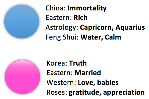
It is very important knowledge of these things if we want to extend our deal (any; website, market, product…) to other countries because they can viewed us positively or not. Next I want to show examples of companies colour and it meaning:
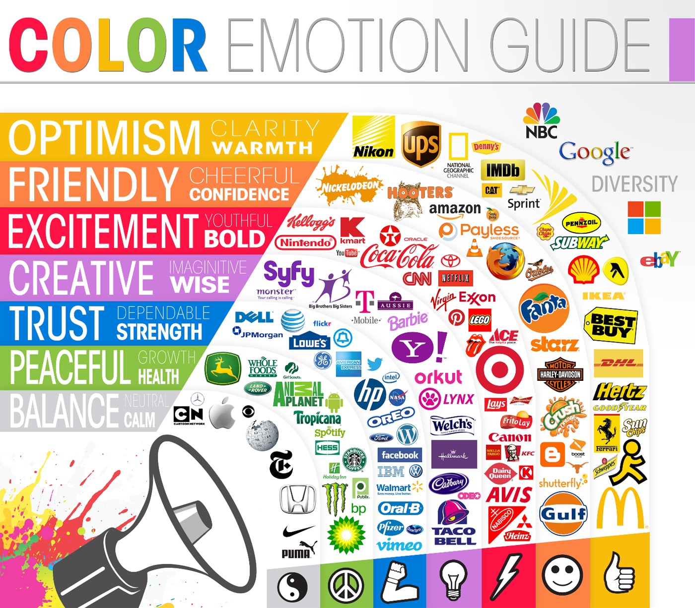
BLUE:
- Ocean, heaven, peace, trust, truth, intelligence.
- Common in financial companies, high tech, computational industry, airlines, spa, clinics….
GREEN:
- Nature, peace, fresh, healthy, prestige, calm.
- Security companies, environmental products or medicines.
We also associate colour with acts, for example in buttons:
Red button means things like: DELETE, STOP, WARNING, don’t give you security.On the other hand, Green button means: GO!, OK, CORRECT, START giving more confidence to people.
Colours are associate with psychologist. Nowadays developers are more interested in emotional design to work with product’s psychologist.
We can group colour in three groups based in emotional classification:
- Active: warm colours. Give positive, confidence and extroversion.
- Passive: too cold colours. Give feelings like peace and fresh.
- Neutral: Like beige, gray and write. They are transition between previous examples.
There are pages and book about this, in psicologiadelcolor I found relations about colour and its psychologist and it’s very interesting how change it only with a different shade of the same colour.
Additional information
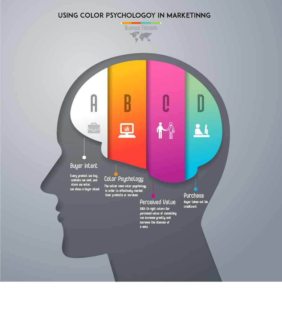
What Is Color Psychology And Why Is It Important In Marketing?, by DarenMarch 8, 2020
Tools
I show you a little part of tools that can help developer to have a perfect colour scheme.
- Adobe Colour CC: Allows make 5 scheme colour.
- Check my Colours: Colours for foreground and background in DOM elements. Is based on W3C algorithms.
- Color hunter: Catch colours from an image.
- TinEye: show user pictures with a specific colour.
- Contrast-A: Make visual effects and show user visual impairments.
Conclusion
When we are developing projects, products, web pages… it’s important to take care about visual aspect of it, but not only to make it nice.
How I tried to show, colour it’s an important and essential tool to empower our project. We can express feelings, expectations, wishes… we can express most with combinations of colours. Developers have to seek advice on custom, market and people of country or city that they wants to sell their product and it’s important to know meaning of colour to express real idea they transmit.
In online word there are many aids to have knowledge about colour and her relatives (likely combinations, meanings, objectives) and we cannot forget to investigate about visual impairments to create the best project (especially web pages) for everybody.
References
- https://delicious.com/tgranollers/GEInform%C3%A0tica-UCD,colour
- http://www.creativebloq.com/colour/tools-colour-schemes-12121430
- http://webdesign.about.com/od/colorcharts/l/bl_colorculture.htm
- http://www.empower-yourself-with-color-psychology.com/cultural-color.html
- https://blog.kissmetrics.com/color-psychology/?wide=1
- http://usabilitygeek.com/colour-user-experience-psychology
- http://www.sitepoint.com/button-ux-red-green
- http://www.usertesting.com/blog/2014/12/02/color-ux-conversion-rates
- http://uxmovement.com/content/how-color-saturation-affects-user-efficiency
- http://uxmovement.com/buttons/how-button-color-contrast-guides-users-to-action
- http://www.uxbooth.com/articles/creating-consistently-colorful-user-experiences-part-1-theory
- http://sobrecolores.blogspot.com.es/2012/01/combinaciones-de-colores-web-accesibles.html
- http://www.w3.org
- http://www.psicologiadelcolor.es
